Healthcare App (iPad)
A tablet app enabling employees to self-administer on-demand hearing tests at their facility using a handheld audiometer.
Problem
Redesign the Salux app flow to make it simple and intuitive for users with low tech literacy, limited education, or visual/hearing challenges (e.g., factory/construction workers). Focus on visual cues, minimal text, and easy navigation for independent hearing tests.
Outcome
Redesigned the app, simplified for the targeted users. Through research and testing, I created an intuitive interface with visual cues, minimal text, and easy navigation, enabling users to independently conduct hearing tests. The result is a highly accessible, user-friendly app.
Timeline
8 Weeks
Type
iPad App
Client
Examinetics
Role

User Research
Insights and Analysis
Got the needed data from the client and I conducted focused research by interviewing 5-6 individuals matching our target user profile. These user testing provided valuable insights into their needs, challenges, and behaviors, helping shape a user-centric design approach. Key findings include:
62%
of users struggle to navigate through the designs and frequently require assistance from technicians.
This dependency forces proctors to intervene constantly, increasing service costs and highlighting the need to optimize user independence.
30%
of Users Fall Within the 40-70 Age Range
Many of whom are unfamiliar with mobile devices and tablets. This creates navigation challenges, emphasizing the need for a simplified, intuitive design.
(client data)
2/6
of individuals from Interview couldn’t move past login
While the remaining 4 logged in but couldn’t complete the test. This reveals critical usability issues in both the login and testing phases.
Usability Testing and Solutions
[Highlighting major changes]
Took feedback from clients and end-users to identify pain points. Implemented solutions like simplified navigation and enhanced visual cues in screen designs.
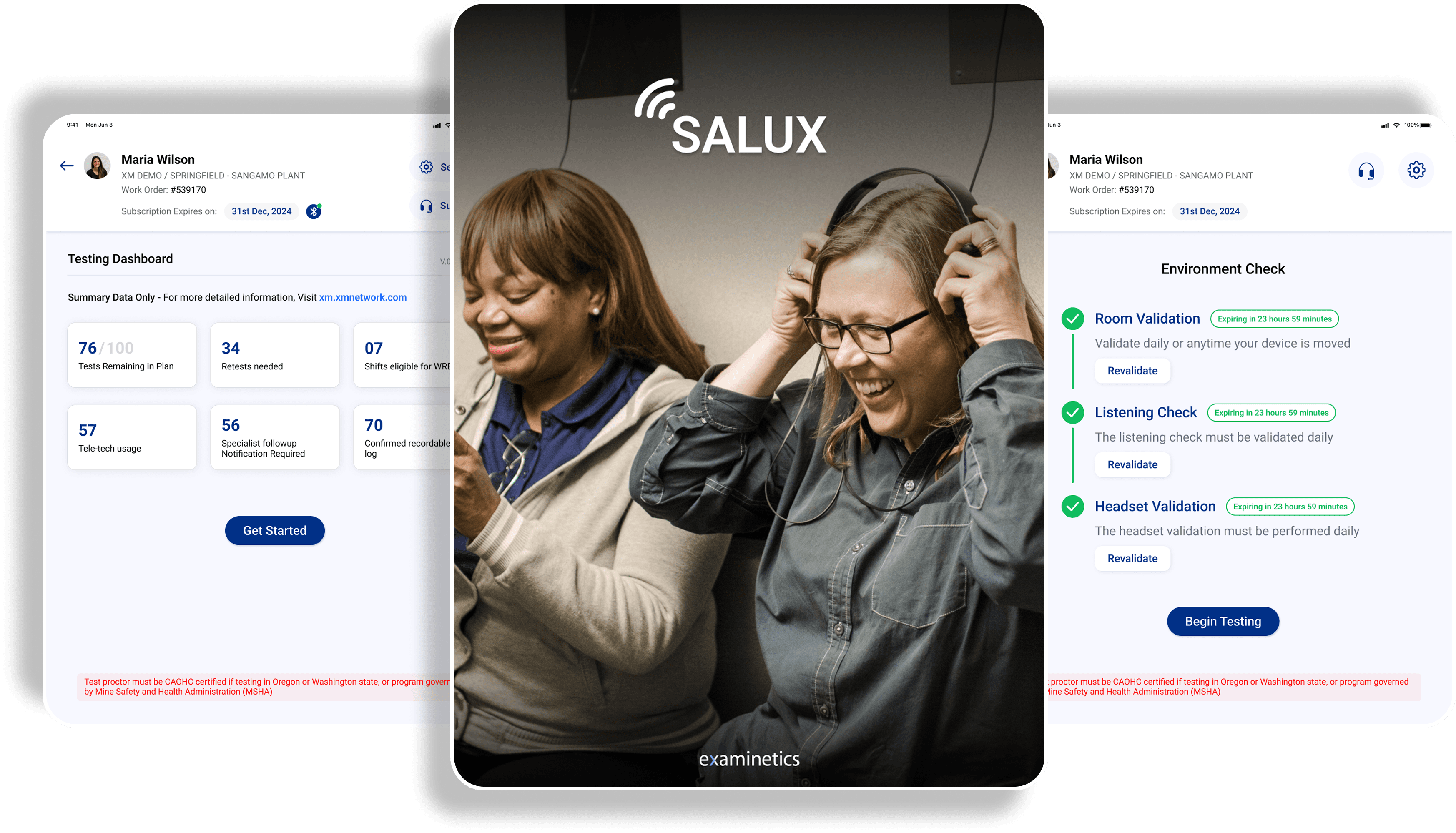
(Technician’s screen)
Before
Overloaded text, unclear navigation, buried actions, and cluttered controls confused users.

After
Streamlined text, intuitive icons/buttons, clear hierarchy, and minimal layout guide users effortlessly
(Participant’s screen)

Before
Issue: Red/Green "Yes/No" buttons (e.g., red for "Yes" on sensitive questions like hearing loss) risk stigmatizing users, feeling exclusionary. Needs ui fixes and clear instructions.
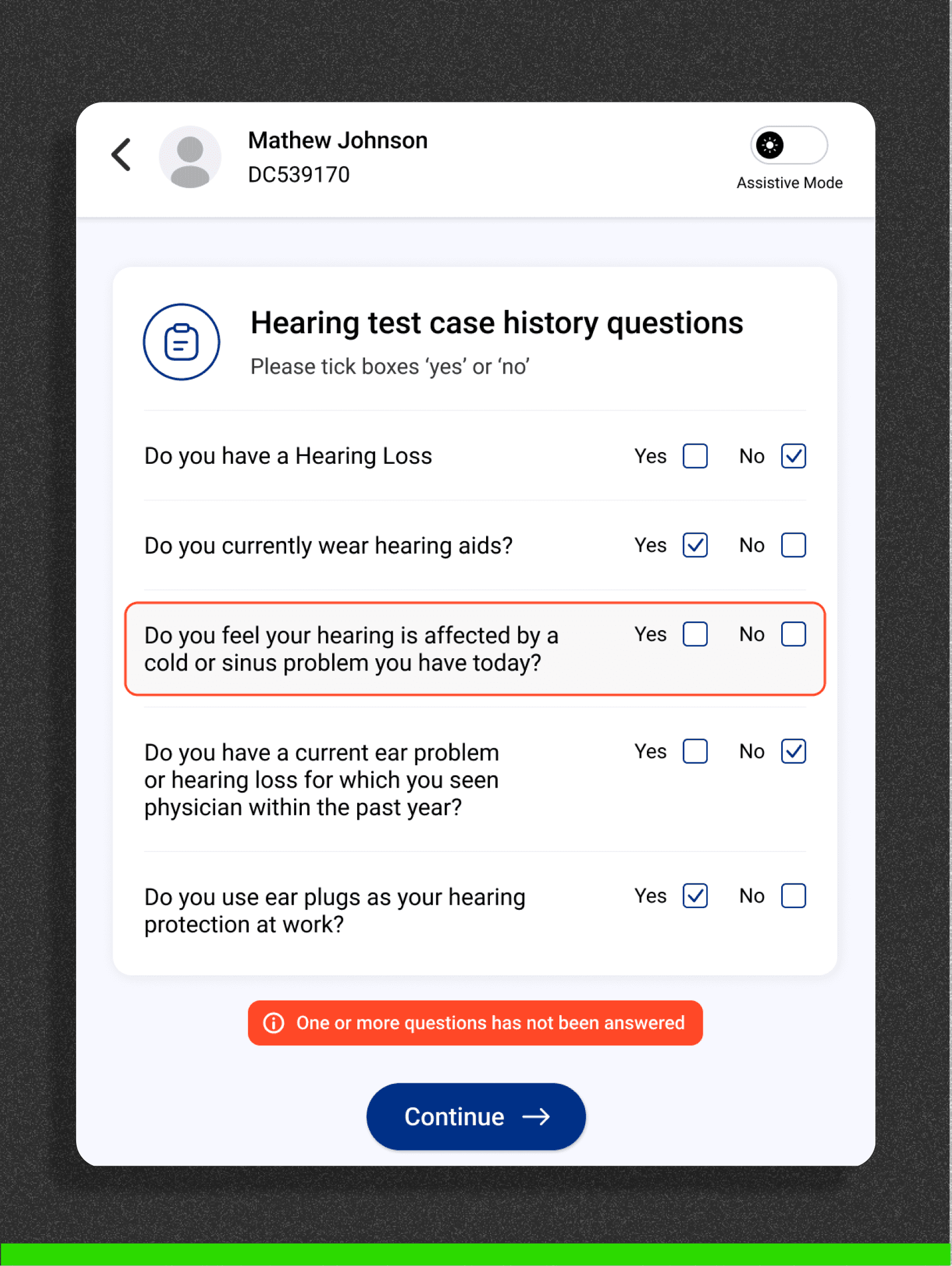
After
Fix: Neutral colors, Physical form like boxes to give familiar experience, and concise, empathetic instructions to ensure inclusivity.
(Participant’s screen)
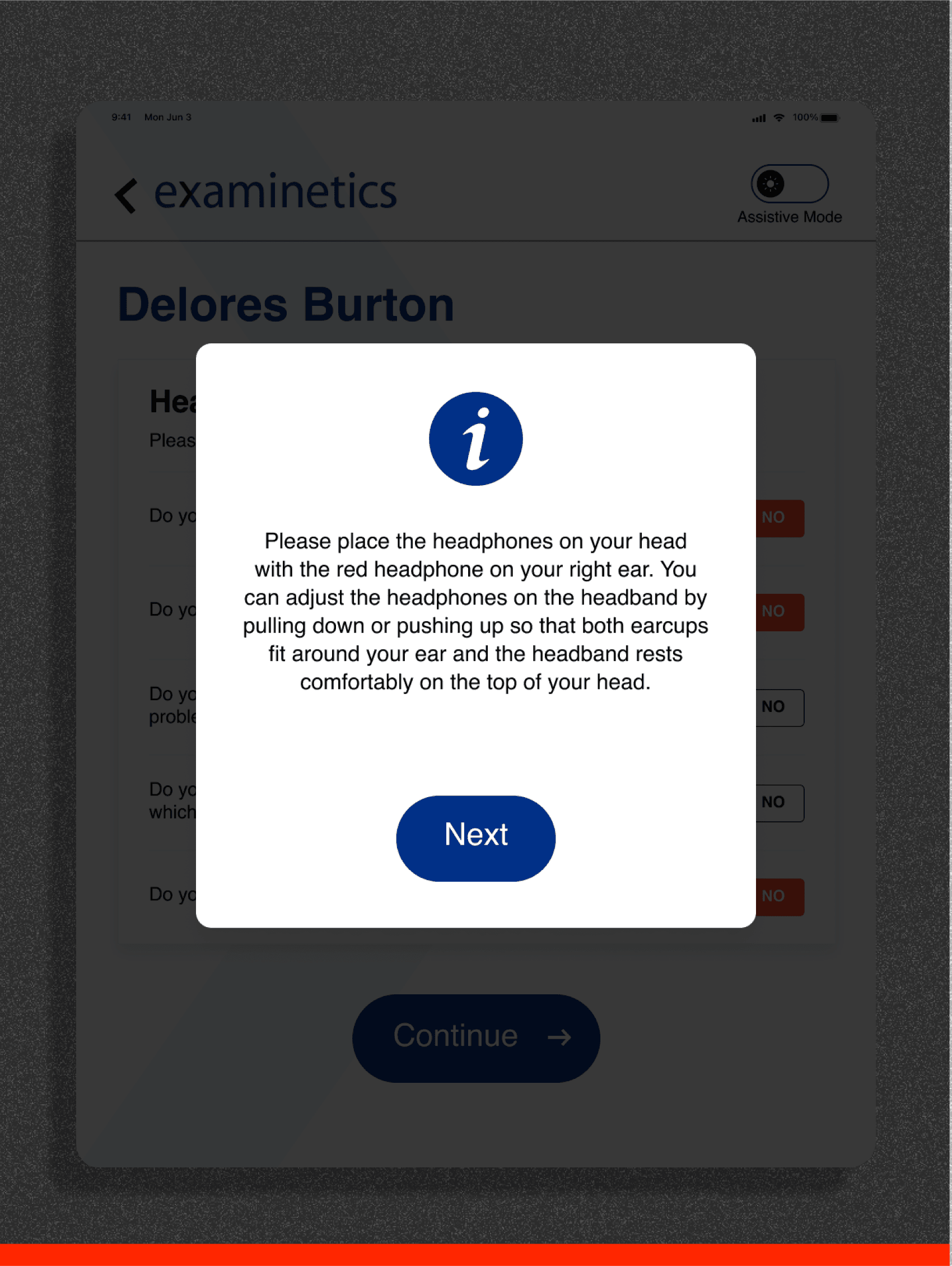
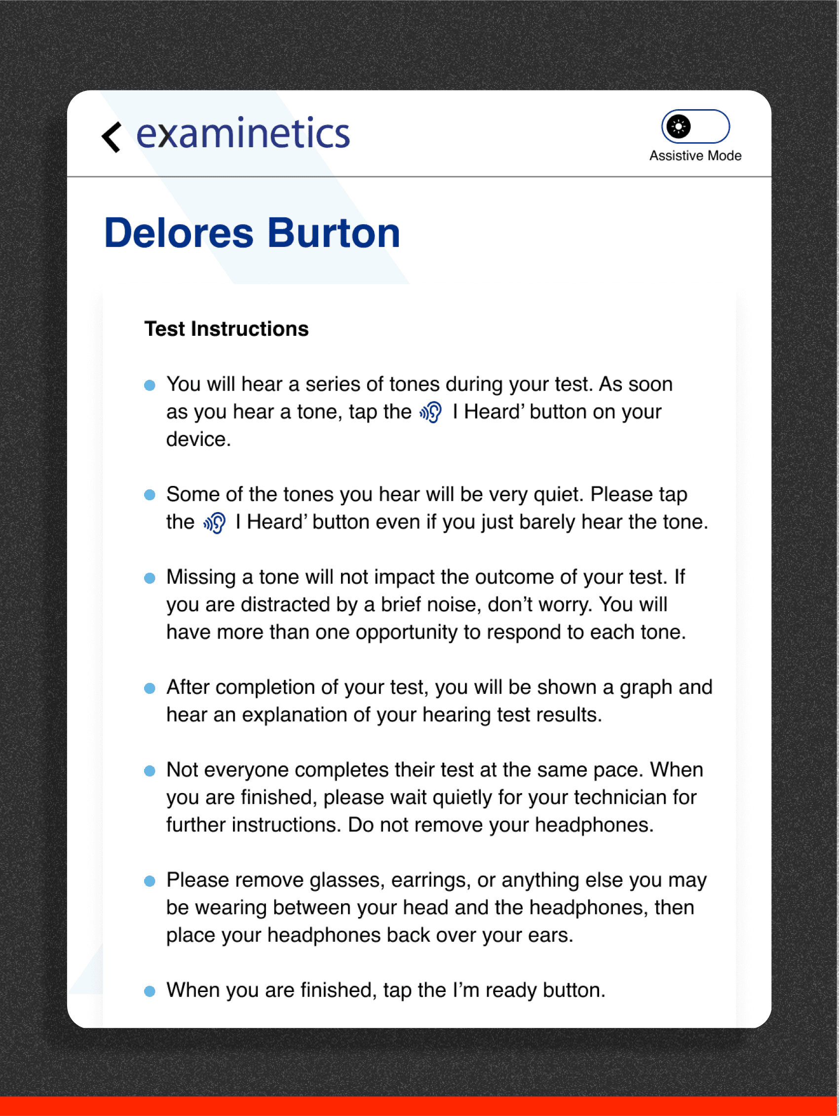
Before
Overwhelming instructions to read, Needs clear UI and
better navigation for users

After
Spot on Title with reference image and clear instructions, replaced next button with much more relative text.
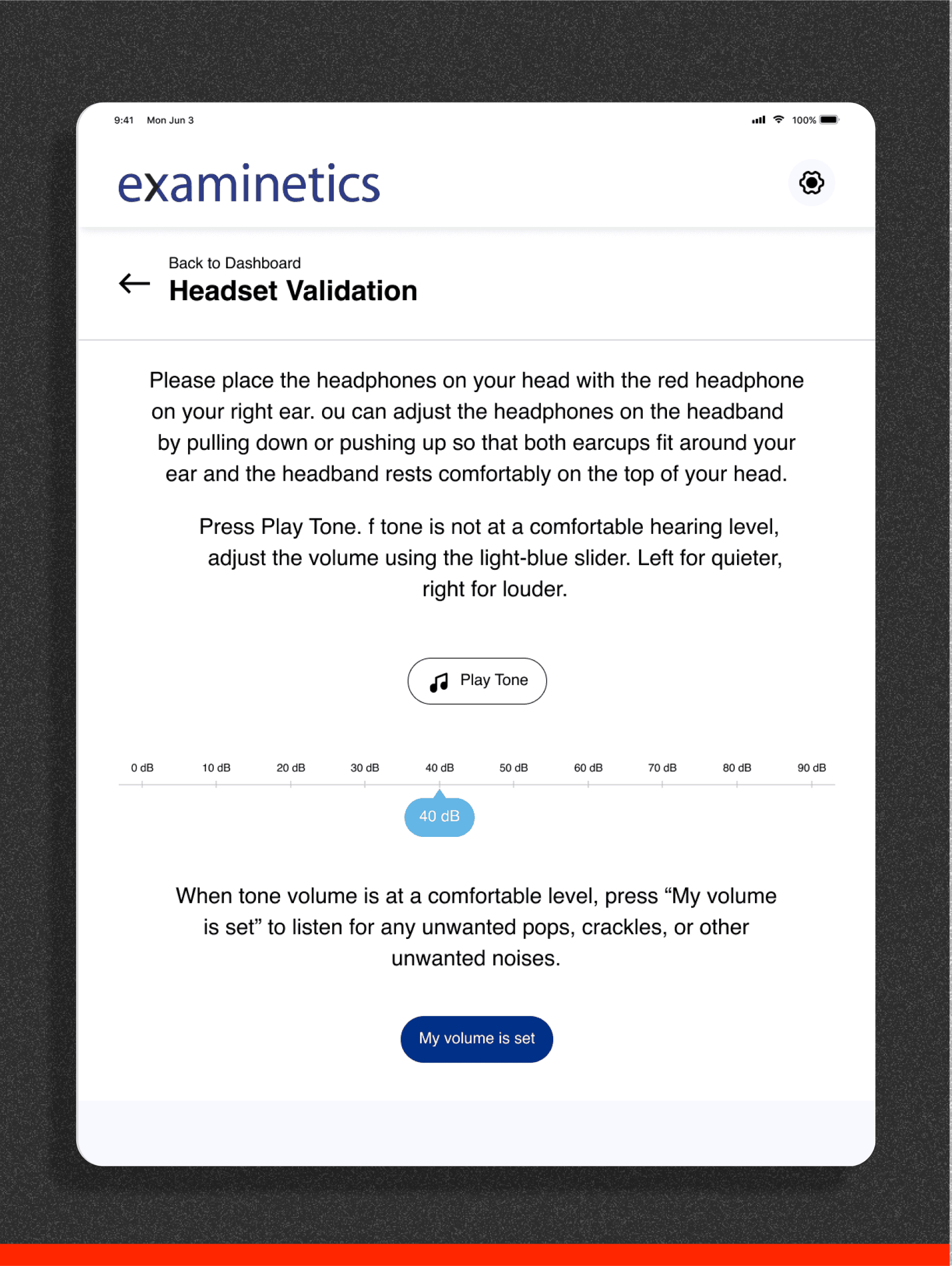
(Participant’s screen)
Before
Overwhelming instructions to read, Needs clear UI and
better UX for the users who are having difficulties using the app.
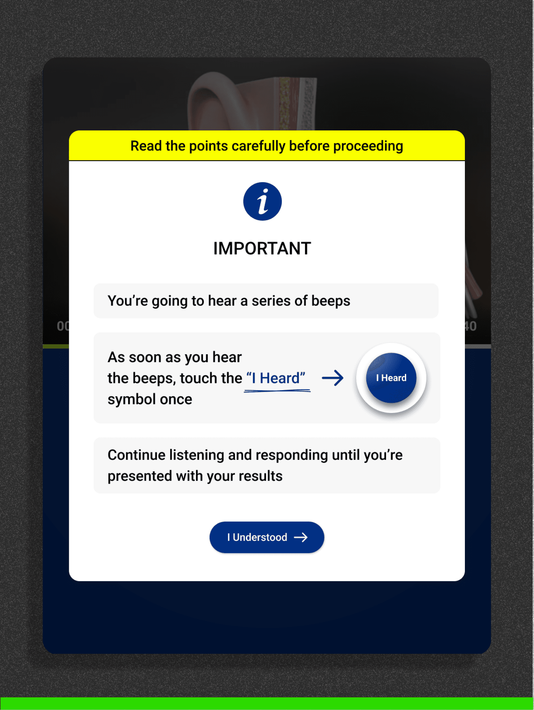
After
Clear Instructions with highlighted navigations and reference to button, High contrast title with yellow and black so that user don’t skip without reading
(Participant’s screen)
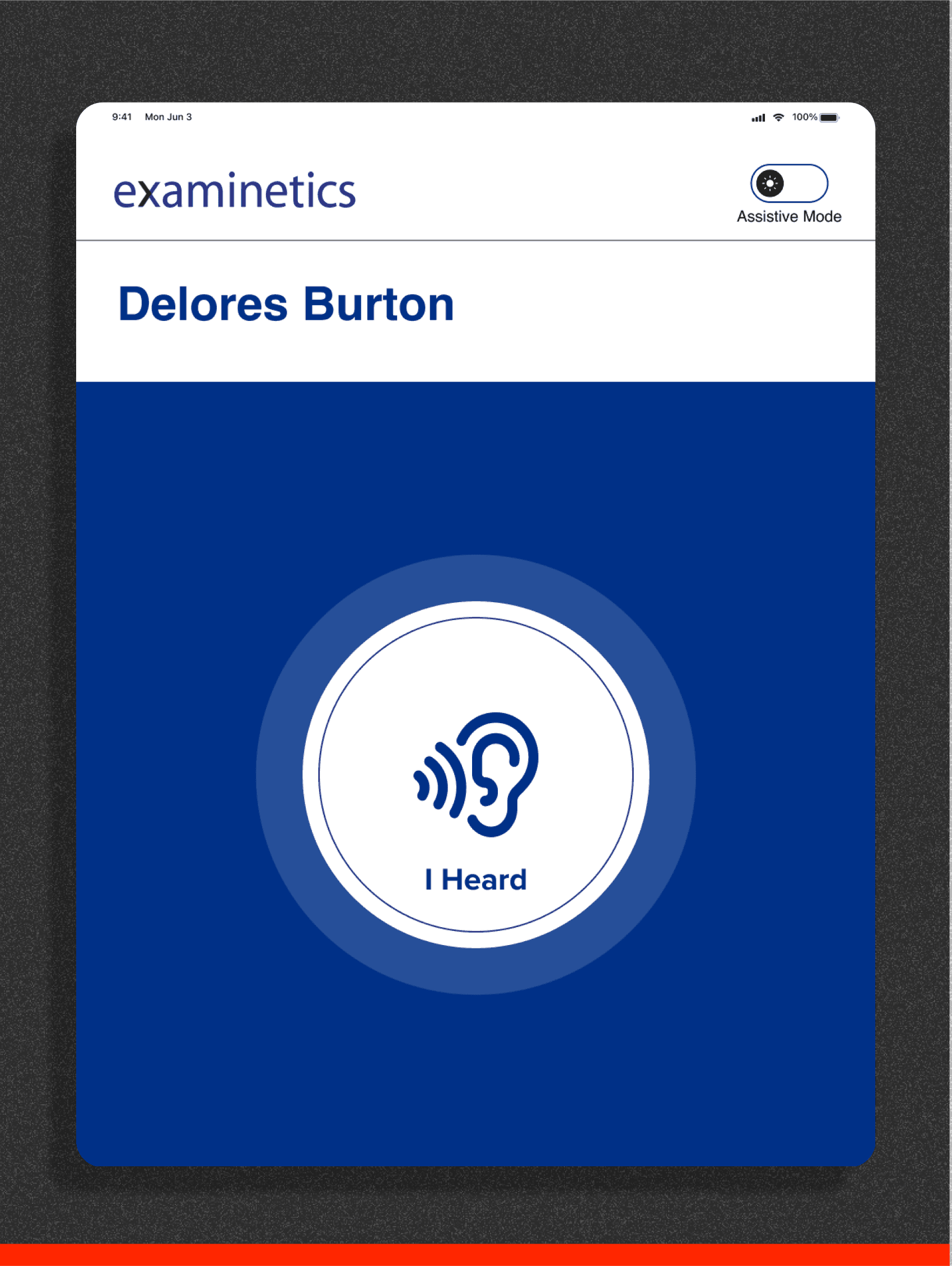
Before
Small text with Ear Icon, Users with low vision may not be able to read, Unnecessary header and titles.
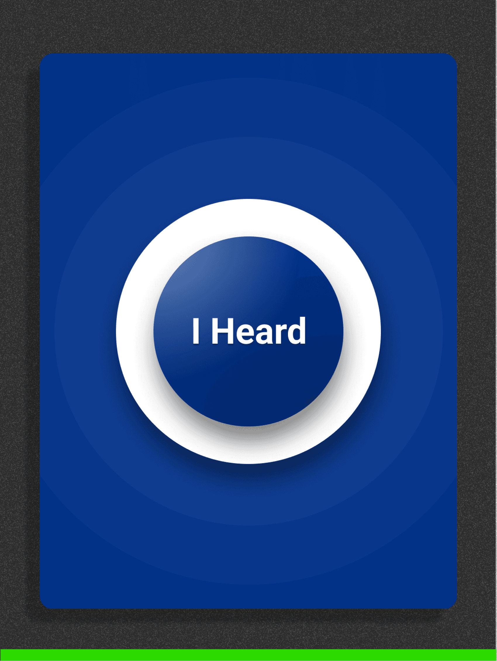
After
Just one button which looks like buzzer, Users can see this is actually a button to press. When pressed there’ll be a vibration with gestures.
Sitemap

Final Designs
With Comprehensive User Flows
Through iterative feedback and in-depth user research, the design was refined to align perfectly with user needs. The result is a seamless, intuitive experience, structured into distinct, well-optimized flows that ensure clarity and ease of use for all stakeholders.