Peerfives - P2P Engagement Tool
Peerfives is a peer-to-peer platform for workplace recognition, rewards, and collaboration. Celebrate contributions, redeem rewards, and gain insights effortlessly!
Problem
Design a landing page and hero section that instantly conveys the product's value, aligns with the existing theme, and outshines competitors. Create a visually engaging, user-friendly experience that captures attention and reinforces brand identity.
Outcome
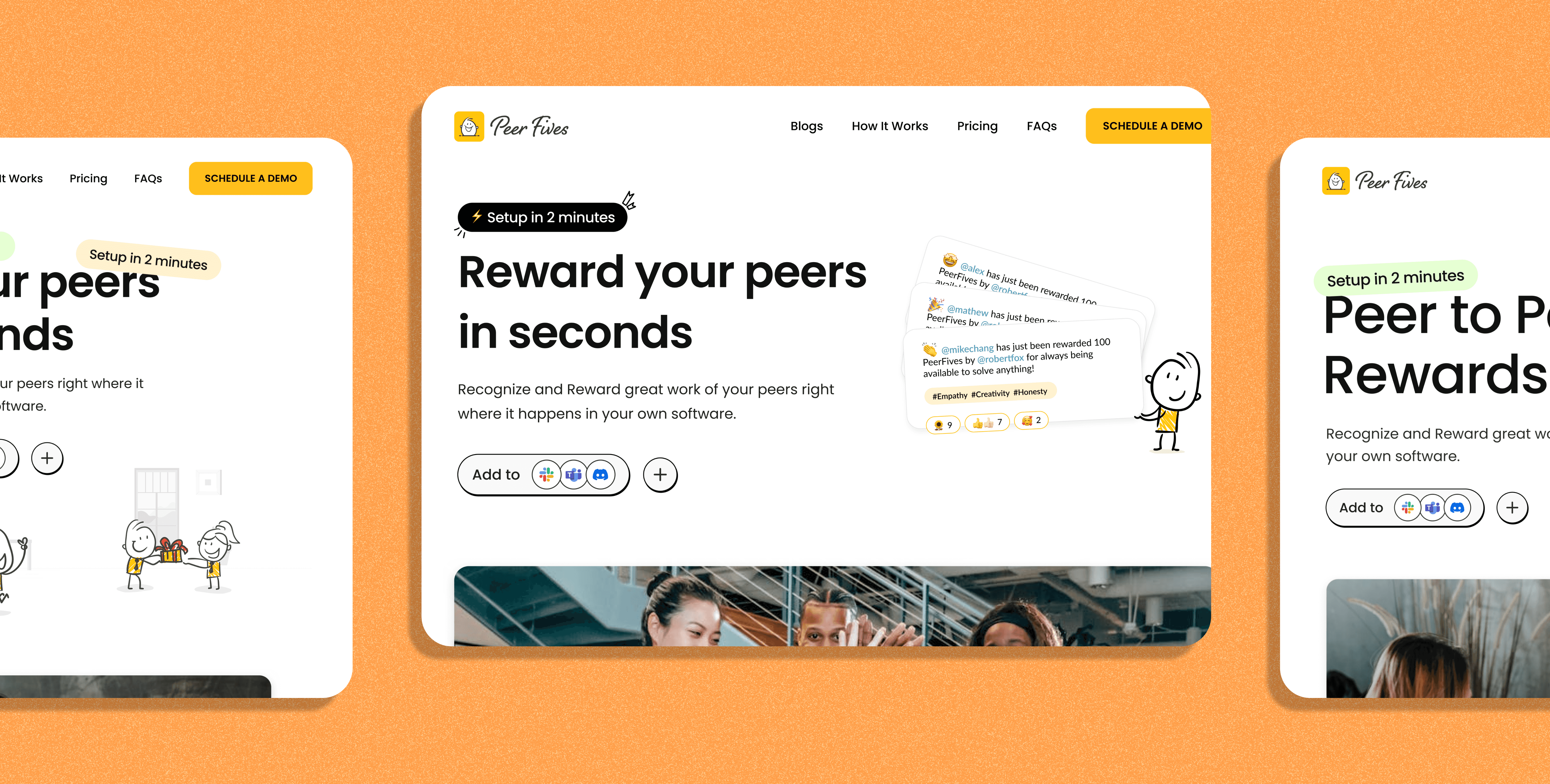
The landing page now features a clear headline and description, instantly conveying the product's value. Prioritizing Slack and Teams integration, it targets companies, HR, and CEOs effectively. An engaging reward animation and a compelling tagline enhance user interaction and brand messaging, creating a visually cohesive and impactful experience.
Timeline
8 Weeks
Type
Client
Solvative
Role

Competitors’ Analysis
and Key Findings
This competitor analysis provides a detailed comparison of leading employee engagement platforms. It highlights key features, design strengths, pricing interfaces, and unique offerings to identify market opportunities and areas for improvement.

1.
Design & User Interface:
Platforms with minimal, well-structured designs (like Hey Taco and Assembly) tend to stand out, while cluttered or poorly organized interfaces (like HiThrive) can hinder user experience.
Fun, engaging elements (like emoji-based menus or casual pricing) add a unique touch that makes the product more relatable and memorable.
2.
Feature Balance:
Some platforms (like Vantage Circle) offer comprehensive feature sets but risk overwhelming users with too much information. On the flip side, simpler platforms (like Work Tango) might lack competitive feature depth.
Striking the right balance between simplicity and functionality is key to standing out.
3.
Pricing & Value Perception:
Platforms with thoughtful pricing sections or calculators (like Karma and Hey Taco) help users immediately see the value they’re getting.
Poorly designed pricing sections (like HiThrive) can turn potential customers away, even if the features are strong.
Presented Solutions
as Hero Section
Crafted multiple hero section designs tailored to the client’s requirements, integrating insights and added value from the competitor analysis. Each option addresses specific user needs, enhances engagement, and highlights key differentiators to create a compelling first impression.
A Carousal to Indicate the
Rewarding Process
It’s essential to present your process in a clear, engaging way that users can easily follow. A carousel is a great tool for this, as it visually guides users through each stage of the journey. This approach aligns well with a landing page narrative, start with your product’s impact, then smoothly transition into how it works step by step.

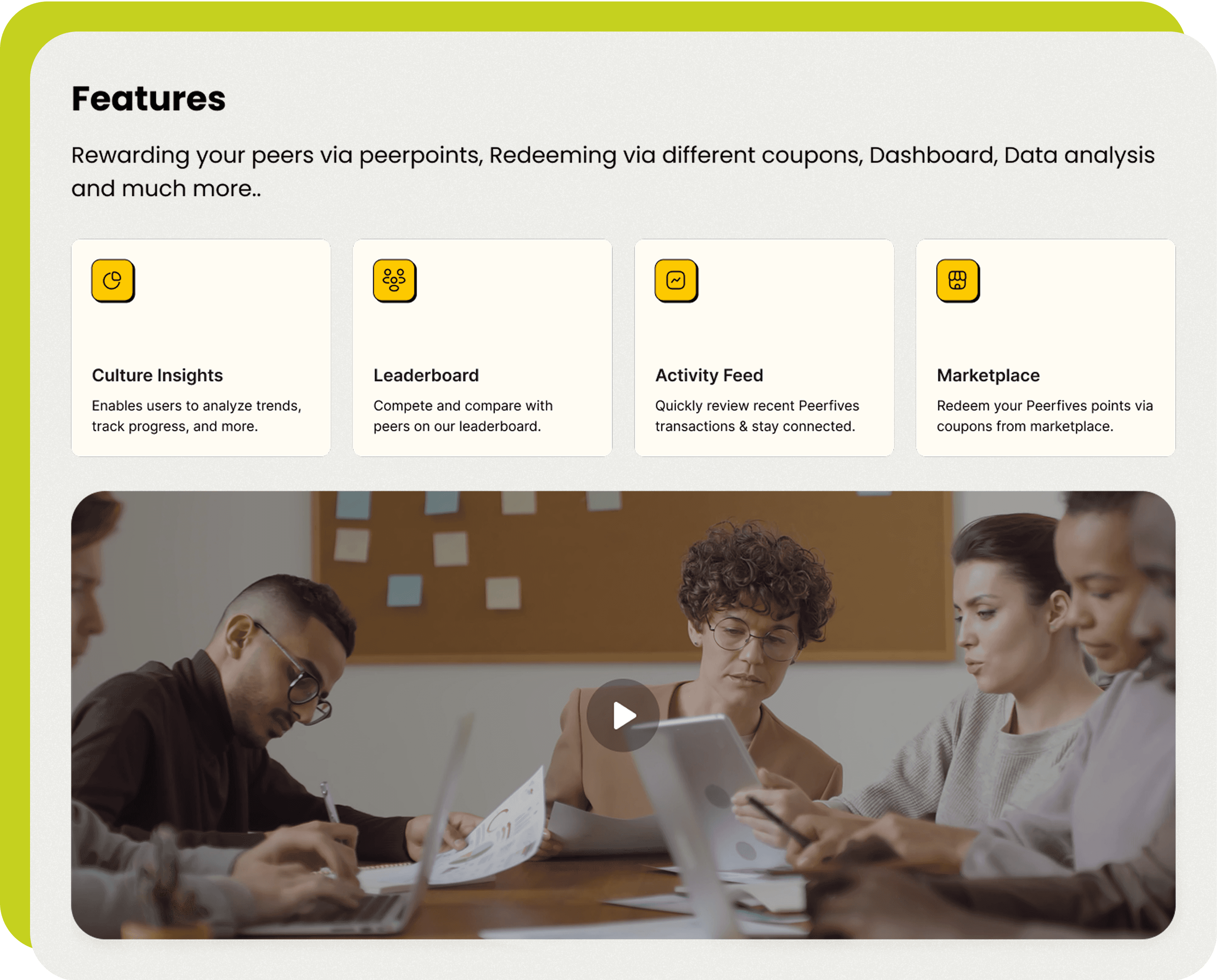
Features and
Services
Explore the key features that enhance peer recognition and engagement. From rewarding peers with points to redeeming them through various coupons, Peerfives offers a robust platform with insightful analytics, dynamic leaderboards, real-time activity feeds, and a diverse marketplace. These features help foster a culture of appreciation while keeping teams connected and motivated.
Features and services listing ⚡
Video showing all the services that’re being provided with screen recordings ❇️️
Pricing Plan and
Highlighting Features with Results
Effortlessly build team culture with transparent pricing, free trials, and seamless Slack integration. Reward teammates, track culture insights, and celebrate wins with emojis and hashtags — all designed to scale with your team’s growth.


Final Designs
with finalised flows
The final designs bring everything together with a seamless, intuitive experience. The landing page tells a compelling story, making it easy for target users to understand the product’s value and how it stands out from competitors. Testimonials and real-time user data highlight tangible results, reinforcing the platform’s impact. From smooth onboarding to effortless peer recognition, every flow is thoughtfully crafted to reduce friction and enhance usability. Clear pricing options, Slack integration, and scalable interactions ensure the platform grows alongside teams, delivering a simple, yet powerful experience.